Agree with qs on monreal: everything seems jittery there, he and Gibbs at times do double work without conviction, and it all looks quite messy. That he can jump and head and take care of the ball - nice, but (as Flo mentioned) this is not enough when we face serious opposition. Defense doesn't look assured at all at this time.
[font=Source Sans Pro]About Burnley: Did we ever establish what the deal was with the lollipop lions and the CD slot, by the way?[/font]
[font=verdana, tahoma, arial, sans-serif][font=verdana, tahoma, arial, sans-serif](Taken from wherever.com)
[size=x-small]Burnley took up a modification of the town’s coat of arms as their first insignia. What does it tell us?
[/size][/font][/font]
[font=verdana, tahoma, arial, sans-serif][size=x-small]The blue wavy line represents the river Brun. The wheat signifies the rurality of the former Burnley Rural District. The hand represents the town of Burnley’s motto Hold to the Truth, derived from that of the Towneley’s family “Tenez le Vraye” The Towneley’s had for long been associated with the Burnley area. Aahh, there! That all too familiar lion popping up again, an heraldic symbol depicted in untold varieties in various coats of arms, mainly as a supporter. In the original coat of arms of Burnley two lions from the Delacy family act as supporters. But this lion represents royalty, Turf Moor being the first ground to have been visited by a monarch when in 1886 Prince Albert watched the first half of Burnley v Bolton. Quite why he didn’t stay for the second half isn’t clear – perhaps the pies weren’t up to much. This visit by the way added another nickname for a short time: The Royalites.
[/size][size=xx-small][font=verdana, tahoma, arial, sans-serif]To complete the menagerie there’s a stork on top of the badge. It is the punning stork of the Starkies, prominent in Padiham and the Burnley rural area. In its mouth it holds the Delacy knot, the badge of the aforementioned DeLacys, who held Burnley and Blackburnshire in medieval times. Our stork stands on a hill surrounded by cotton plants – the prime industry of the town to recent times.[/font][/size]
[size=xx-small][font=verdana, tahoma, arial, sans-serif]Today’s registered trademark was introduced in the 1970’s. The elements of the badge still have that significance to the town as well as to the football club. 1882 represents the year that Burnley Football Club was formed. The lions represent royalty as above. The bee represents the busy town and the saying ‘as busy as a bee’ and the Beehole end of the ground as it was called in days gone by. All derived of course from the B at the beginning of Burnley. The knight’s helmet represents two knighted families in Burnley, the Towneleys and the Shuttleworths at Gawthorpe, long associated with the Burnley area. The shuttle represents Burnley’s cotton industry heritage and is taken from the arms of the the Shuttleworth family, as seen in the Padiham device and the Rural District Council crest. The hand still stands for the towns’ motto.
[/font][/size][size=xx-small]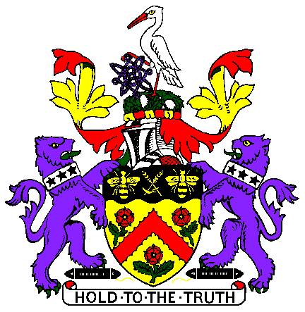 [/size]
[/font]
So it's a bee hole (not a sh... - eh, you know), it's really a stork, and the mystery lollipop lions are anyone's guess. Also, it appears that the original stork was trying to solve some brain-teaser, it was later dumped for the more realistic/less ambitious duck and an egg...
3-0, Sanchez, thats the only meaningful image. 🙂
